Affinity mapping helps you turn research findings into insightful clusters by grouping similar ideas, patterns, and themes. As you organize raw data, you’ll identify key pain points, user needs, and opportunities for innovation. This visual approach makes complex information easier to understand and share with your team. By focusing on overarching themes rather than individual comments, you can make smarter decisions. Keep exploring to learn how this method can transform your research into actionable results.
Key Takeaways
- Collect and post research findings as notes to visually organize data for easy clustering.
- Group similar notes to identify patterns, themes, and relationships across research insights.
- Use affinity clusters to prioritize issues, opportunities, or user needs for targeted solutions.
- Facilitate team discussions around clusters to interpret data and derive actionable insights.
- Transform raw findings into meaningful narratives that inform strategic decision-making and design improvements.

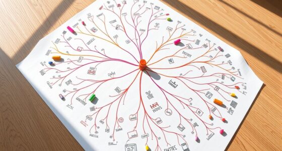
Affinity mapping is a powerful technique used to organize and synthesize large amounts of data or ideas by grouping similar items together. When you’re working on improving user experience, this method becomes invaluable, especially during collaborative analysis sessions. It helps you see patterns and connections that might otherwise be hidden in chaos, making complex information more manageable and meaningful. As you gather user feedback, survey results, or interview notes, affinity mapping allows you to transform scattered insights into organized clusters, revealing the core themes and pain points. This process is particularly effective in team settings, where collective input accelerates understanding and consensus.
Affinity mapping organizes complex data into meaningful clusters, revealing patterns and core themes to improve user experience collaboratively.
In a collaborative environment, you and your team can brainstorm, post notes, and move them around on a large surface—be it physical or digital—fostering a shared understanding of the data. This active participation encourages diverse perspectives, which often leads to richer, more nuanced insights about user experience. As you cluster related ideas, you start to see common frustrations, preferences, or behaviors emerge clearly. This visual organization streamlines your analysis, saving time and reducing confusion, especially when dealing with a large volume of qualitative data. It shifts your focus from individual comments to overarching themes, empowering you to prioritize design improvements or feature enhancements based on actual user needs.
Affinity mapping isn’t just about sorting data; it’s about creating a narrative from the information at hand. When you facilitate collaborative analysis, you harness the collective intelligence of your team, making the process more dynamic and inclusive. Everyone contributes, which often results in a more holistic understanding of the user experience landscape. As clusters form, you can identify opportunities for innovation or pinpoint critical issues that require immediate attention. The visual nature of affinity maps makes complex relationships easier to grasp, enabling you to communicate findings more effectively to stakeholders.
This method also promotes a problem-solving mindset. Instead of being overwhelmed by raw data, you focus on distilling insights, which helps in designing more user-centered solutions. The act of grouping similar ideas encourages discussion and debate, ensuring that your team considers different angles before making decisions. Additionally, understanding how real couples navigate their relationships can provide valuable insights into long-term partnership dynamics. Ultimately, affinity mapping transforms what might seem like an unmanageable collection of data into clear, actionable insights—making your analysis more efficient and your solutions more aligned with user needs.
digital affinity mapping tools
As an affiliate, we earn on qualifying purchases.
As an affiliate, we earn on qualifying purchases.
Frequently Asked Questions
How Do I Prioritize Clusters After Affinity Mapping?
To prioritize clusters after affinity mapping, start with insight ranking by evaluating each cluster’s impact, feasibility, and relevance to your goals. Consider how well each cluster addresses key user pain points or opportunities. Use criteria like urgency, potential value, and ease of implementation to rank them. This helps you focus on high-priority clusters that deliver the most significant insights, ensuring your efforts align with strategic objectives.
What Tools Are Best for Digital Affinity Mapping?
You should explore digital tools like Miro, MURAL, and Microsoft Whiteboard for digital affinity mapping. These collaboration platforms let you easily organize, cluster, and visualize research findings with your team. They support real-time collaboration, making it simple to brainstorm and refine insights together. Using these tools, you can efficiently create, adjust, and share your affinity maps, ensuring everyone stays aligned and engaged throughout the process.
How Can I Involve Stakeholders in the Process?
Imagine a room buzzing with ideas, where your stakeholders actively shape insights. You involve them through stakeholder engagement by hosting collaborative workshops, encouraging open dialogue, and sharing preliminary findings. This approach fosters ownership and diverse perspectives, enriching your affinity mapping process. By making stakeholders part of the journey, you create a sense of collective insight, ensuring the final clusters truly reflect everyone’s understanding and needs.
How Do I Handle Conflicting Insights Within Clusters?
When you encounter conflicting insights within clusters, you should practice cluster reconciliation by examining the data carefully. Discuss these conflicts with stakeholders to understand different perspectives, and look for common themes or underlying patterns. Prioritize insights based on their relevance and impact, and consider re-clustering if needed. This approach helps you resolve conflicts effectively, ensuring your insights are clear, balanced, and actionable for decision-making.
What Are Common Pitfalls to Avoid During Affinity Mapping?
Avoid pitfalls like bias bias mitigation, which can skew your clusters, by staying objective and questioning assumptions. Don’t rush naming clusters; thoughtful names guide understanding. Be cautious of forcing data into preconceived categories, like fitting a square peg into a round hole. Keep your process flexible, and regularly review to prevent overlooking important insights. This way, your affinity mapping remains clear, accurate, and truly reflective of the research findings.
Lincia Large Dry Erase Task List 36 x 24 Inch Erasable Task Planner White Board for Wall Big Whiteboard Employee Assignment Tracker for Office Managing and Tracking Tasks to Increase Productivity
Product Includes: a magnetic, dry erasable whiteboard; Wall mountable, it's a professional planning tool for listing specific tasks,…
As an affiliate, we earn on qualifying purchases.
As an affiliate, we earn on qualifying purchases.
Conclusion
Now that you’ve mastered affinity mapping, you can turn chaos into clarity—like herding cats into a neat little line. Your research findings will cluster together effortlessly, resembling a well-organized backyard sale, where every item finds its perfect spot. No more scattered notes or half-baked ideas; instead, you’ll have insights as tidy as a librarian’s bookshelf. So go ahead, turn those wild thoughts into a beautifully curated collection—your future self will thank you for the tidy chaos!

Machine Learning with R
As an affiliate, we earn on qualifying purchases.
As an affiliate, we earn on qualifying purchases.

The Visual Organization: Data Visualization, Big Data, and the Quest for Better Decisions (Wiley and SAS Business Series)
As an affiliate, we earn on qualifying purchases.
As an affiliate, we earn on qualifying purchases.