
Color psychology in prototyping influences how users perceive and react to your design. Choosing the right hues builds trust, guides emotions, and encourages desired actions, while overuse or clashing colors can distract or overwhelm users. Cultural variations also affect interpretation, so being sensitive to regional meanings is vital. Striking the right balance ensures your prototype communicates effectively and engages users. Keep exploring these strategies to create impactful, behavior-driven designs that resonate universally.
Key Takeaways
- Strategic color choices can enhance user engagement and guide behavior, but poor hue selection may cause confusion or negative perceptions.
- Colors evoke emotional responses; inappropriate hues can induce stress, overwhelm, or mistrust in prototypes.
- Cultural differences in color symbolism can lead to miscommunication or unintended offense if not carefully considered.
- Overuse of bright or clashing colors can distract users and hinder usability, undermining the interface’s effectiveness.
- Well-aligned color schemes reinforce brand identity and trust, while inconsistent hues may diminish credibility and user confidence.
Understanding the Basics of Color Psychology

Color psychology explores how different hues influence our emotions, perceptions, and behaviors. When you understand hue psychology, you realize that each color can evoke specific feelings or reactions. Your color perception isn’t just about seeing shades; it’s about how your brain interprets them based on context and personal experiences. For example, red often signals urgency or passion, while blue can promote calmness and trust. Recognizing these associations helps you select colors intentionally in prototyping to guide user responses. By understanding the basics of color psychology, you can leverage hues to enhance user engagement and communication. This foundational knowledge is vital for designing prototypes that resonate emotionally and effectively influence perceptions.
How Color Choices Influence User Trust and Credibility
Choosing the right hues can substantially impact how users perceive your brand’s trustworthiness and credibility. Consistent color use across your prototype reinforces brand identity, making users feel more confident in your offerings. Colors like blue and green are often associated with reliability and stability, which can boost user trust when applied thoughtfully. Ensuring your color choices meet accessibility standards is also essential; using sufficient contrast guarantees that all users, including those with visual impairments, can navigate your interface comfortably. When your color palette aligns with your brand’s values and remains consistent, it signals professionalism and dependability. Incorporating color psychology principles into your design can further enhance emotional resonance and user confidence. Ultimately, strategic color choices foster credibility, encouraging users to trust your product and engage more deeply.
The Impact of Color on Emotional Responses During Prototyping

During prototyping, the hues you select can evoke powerful emotional responses that influence how users experience your design. Colors act as emotional triggers, shaping feelings like trust, excitement, or frustration. For example, warm tones such as red or orange can increase energy and urgency, while cool shades like blue promote calmness and stability. Your color choices directly impact mood influence, affecting whether users feel engaged or overwhelmed. Recognizing how specific colors trigger emotions allows you to craft prototypes that resonate on a deeper level. When used intentionally, color can enhance positive reactions and mitigate negative ones, guiding users toward desired behaviors. Being mindful of these emotional responses ensures your prototype communicates the right message, fostering a more impactful and user-centered experience. Additionally, understanding the impact of cybersecurity vulnerabilities can help designers consider secure color schemes that reinforce trust and safety in digital prototypes.
When Colors Distract: Recognizing Overuse and Clashing Hues

When you use too many bright colors, they can overwhelm users and create visual noise. Clashing color schemes also distract by drawing attention away from key features. Recognizing these risks helps you create prototypes that guide focus without causing unnecessary confusion. Incorporating color psychology principles can further enhance user experience by promoting clarity and emotional response.
Bright Colors Overload
Bright colors can instantly grab attention, but overusing them or combining clashing hues often results in visual overload that distracts rather than guides users. Neon overload, in particular, can be overwhelming when palette saturation is too high, making interfaces feel chaotic and hard to process. When every element is vivid and intense, your users may become fatigued or confused, reducing usability. Instead of highlighting important features, excessive bright colors can compete for attention, leading to distraction. To avoid this, balance bold hues with neutral tones and limit the use of highly saturated colors. Proper moderation helps maintain focus and clarity, ensuring that the colors serve their purpose without overwhelming the user. Additionally, understanding AI vulnerabilities can help designers create more resilient and user-friendly prototypes by anticipating potential visual fatigue or misinterpretation caused by overly aggressive color schemes. Remember, sometimes less is more when it comes to effective color use in prototyping.
Clashing Color Schemes
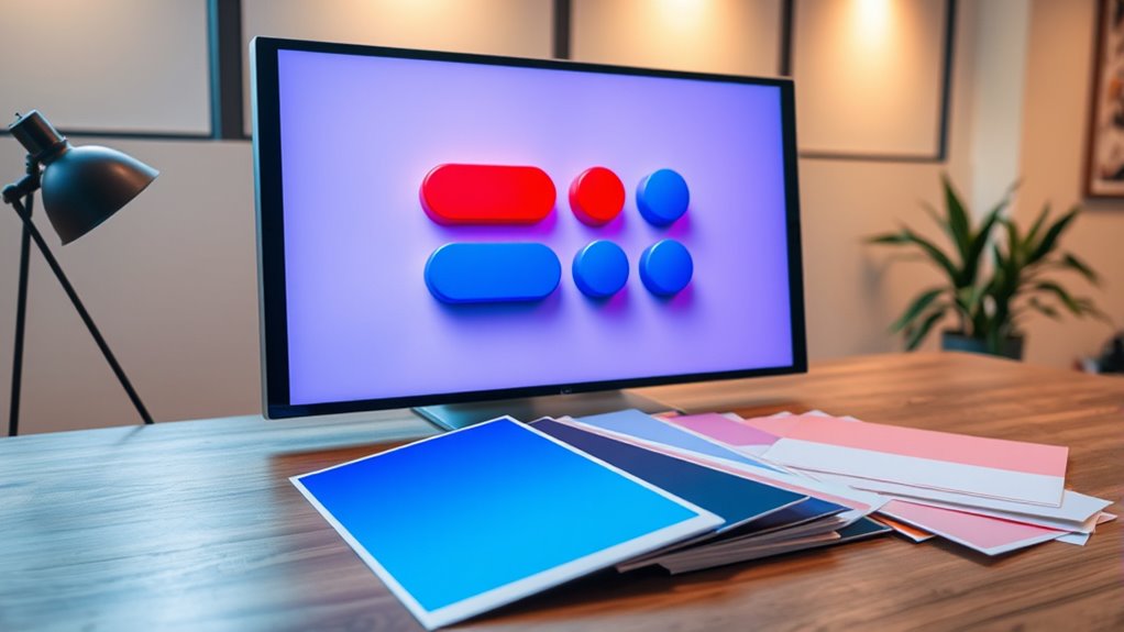
Clashing color schemes occur when hues are used together without harmony, leading to visual confusion and distraction. When colors clash, they break the principles of color harmony, making it difficult for users to focus or interpret information correctly. To avoid this, maintain palette consistency by selecting colors that complement each other and create a cohesive look. Overusing contrasting or incompatible hues can draw attention away from key features, reducing usability. Recognize when your palette lacks harmony—sharp color contrasts or mismatched tones can overwhelm your design. Endeavor for a balanced, harmonious color scheme that guides users naturally through your prototype. Remember, a well-curated palette enhances clarity and focus, making your design more intuitive and visually appealing without causing unnecessary distraction.
Visual Distraction Risks
Colors that are overused or clash can easily distract users from your prototype’s main features. Poor color contrast can make text hard to read or cause important buttons to blend into the background, leading to confusion. When hues clash, visual harmony is lost, creating a chaotic experience that pulls attention away from what matters most. Avoid using too many vibrant or similar tones that compete for attention, as this can overwhelm users. Instead, focus on balancing color contrast to highlight key elements without overwhelming the eye. By maintaining visual harmony, you help users navigate your prototype effortlessly. Recognizing potential distraction risks early allows you to refine your color choices, ensuring your design remains clear, engaging, and user-friendly. Incorporating color theory principles can further enhance your ability to select harmonious hues and avoid visual clutter.
Cultural Variations in Color Perception and Interpretation

You should consider how cultural color associations influence user reactions to your prototypes. Different regions interpret colors uniquely, affecting how your design is perceived. Recognizing regional color meanings guarantees your prototypes communicate the right message across diverse audiences. Additionally, understanding color symbolism in different cultures can help prevent misinterpretations that might lead to negative user experiences.
Cultural Color Associations
Cultural backgrounds markedly influence how people perceive and interpret colors, shaping their emotional responses and associations. This is rooted in color symbolism, where specific hues carry distinct meanings across cultures. For example, white might symbolize purity in one culture but mourning in another. These varying interpretations can lead to cultural color conflicts, especially in global prototyping. If you overlook these differences, your design might evoke unintended feelings or offend your audience. Recognizing these cultural color associations helps you create prototypes that resonate universally or target specific markets effectively. By understanding how different cultures assign meaning to colors, you can avoid miscommunication and enhance user engagement. Ultimately, respecting cultural color symbolism ensures your prototype communicates clearly and respectfully across diverse audiences. Additionally, understanding Cultural Variations in Color Perception can significantly improve cross-cultural communication and prevent misunderstandings in international design projects.
Regional Color Meanings
Regional differences markedly influence how people interpret colors, often leading to varied emotional responses and perceptions. Regional symbolism shapes the meaning of colors based on local customs, history, and traditions. For example, white is associated with purity in Western cultures but signifies mourning in some Asian countries. Geographic color trends also affect perceptions; red may symbolize luck in China and danger in the U.S. These regional variations highlight that color meanings aren’t universal but deeply rooted in cultural context. When designing prototypes, understanding these regional color trends helps prevent miscommunication and enhances user connection. Recognizing the importance of local symbolism guarantees your color choices resonate appropriately across different markets, making your product more culturally sensitive and effective. Additionally, awareness of anime culture and storytelling can inform how visual elements are perceived across different regions, further improving user engagement and understanding.
Balancing Aesthetics and Functionality in Color Selection

Finding the right balance between aesthetics and functionality in color selection is essential for creating effective prototypes. You want colors that attract users and convey your message clearly, but also support usability. Achieving color harmony ensures that your palette is visually appealing and unified, helping users intuitively understand your design. Focus on aesthetic balance by choosing colors that enhance the overall look without overwhelming or distracting from key features. Prioritize contrast to improve readability and accessibility while maintaining visual harmony. Remember, the goal is to create a prototype that’s both attractive and practical. When colors work together seamlessly, they reinforce your message and improve user experience, making your prototype more compelling and easier to navigate. Understanding color psychology can further optimize your choices by aligning colors with user emotions and perceptions.
Case Studies: Colors That Help Drive User Engagement

Case studies reveal how strategic use of color can considerably boost user engagement. For example, companies have used color therapy principles to select hues that evoke specific emotions, guiding users toward desired actions. Red, with its strong hue symbolism, often increases urgency and encourages quick decisions, making it ideal for call-to-action buttons. Conversely, blue fosters trust and calmness, enhancing user loyalty on financial platforms. In one case, a health app employed calming greens and soothing blues to promote relaxation and engagement, resulting in higher retention rates. These examples demonstrate how understanding hue symbolism and psychological impacts of color can transform prototypes into more engaging experiences. Additionally, integrating insights from AI in marketing strategies can help tailor color choices to individual user preferences, further increasing effectiveness. By aligning color choices with user emotions, you can influence behaviors and markedly improve interaction outcomes.
Common Mistakes in Color Application and How to Avoid Them

You might be tempted to use bright colors excessively, but too much can overwhelm users and dilute your message. Ignoring cultural context can also cause misunderstandings or offend your audience. To avoid these mistakes, choose colors thoughtfully and consider the cultural background of your users.
Overusing Bright Colors
While bright colors can grab attention and evoke energy, overusing them can overwhelm users and dilute your design’s impact. Relying too heavily on vibrant hues creates visual noise, making it hard for users to focus on important elements. Instead, aim for monochrome simplicity or soft pastel palettes to balance your color scheme. These subtle choices help highlight key features without causing fatigue. Bright colors should be used sparingly, for calls to action or highlights, rather than everywhere. Overuse can also diminish the psychological effect of color, making your prototype seem chaotic or unprofessional. By limiting bright colors and incorporating more muted tones, you create a more harmonious and user-friendly experience that guides attention effectively without overwhelming the senses.
Ignoring Cultural Context
Ignoring cultural context can lead to misinterpretations and even offend your audience, undermining your design’s effectiveness. Different cultures have unique regional color symbolism, which influences how colors are perceived. For example, white signifies purity in some Western cultures but symbolizes mourning in parts of Asia. Failing to take into account these cultural misinterpretations can cause your prototype to communicate unintended messages or alienate users. To avoid this, research the cultural significance of colors relevant to your target audience. Be aware of regional color symbolism and adapt your palette accordingly. This attention to cultural nuances ensures your design resonates positively and prevents costly misunderstandings. Respecting cultural differences in color perception enhances user trust and engagement, making your prototype more effective across diverse audiences.
Tools and Techniques for Testing Color Effectiveness

To evaluate how different colors influence user perception and behavior in prototypes, you utilize a range of tools and techniques. One effective method is testing with variations in color saturation, which reveals how intense or muted hues impact user responses. You can also experiment with monochrome palettes, isolating a single hue’s effect to understand its psychological influence without distraction. Eye-tracking tools help monitor where users focus, indicating how color choices direct attention. A/B testing allows you to compare different color schemes directly, measuring engagement and conversions. Surveys and feedback forms gather subjective perceptions of color effectiveness. Combining these methods provides exhaustive insights, helping you refine your prototypes to harness color’s psychological power effectively.
Strategies for Using Color to Guide User Behavior Effectively
Using color strategically can markedly influence user behavior by guiding their attention and prompting specific actions. To do this effectively, leverage color symbolism to evoke the desired emotions or associations—such as green for growth or safety. Maintain hue consistency throughout your prototype to reinforce understanding and avoid confusion, ensuring users interpret colors as intended. Use contrasting colors to highlight important elements like calls-to-action, making them stand out and encouraging clicks. Be mindful of cultural differences in color symbolism to prevent misinterpretation. Additionally, consider the context and user expectations to select appropriate hues that align with your goals. These strategies help create intuitive, behavior-driven designs that subtly steer users toward desired outcomes, enhancing overall engagement and effectiveness.
Frequently Asked Questions
How Do Individual Differences Affect Color Perception in Prototypes?
Your individual differences influence how you perceive colors in prototypes. Personal color preferences shape your reactions, making you more receptive to certain hues. Cultural color associations also play a role; for example, some colors may evoke specific meanings based on your background. Recognizing these differences helps you design prototypes that resonate broadly, ensuring your color choices communicate effectively and appeal to diverse audiences.
Can Color Choices Influence User Decision-Making Subconsciously?
Did you know that 85% of shoppers say color plays a key role in purchasing decisions? Color association subtly influences your choices, often without you realizing it. Your emotional response to certain hues can guide your decisions, making you more likely to click, buy, or stay engaged. So, when designing prototypes, strategic color choices can tap into subconscious cues, ultimately shaping user behavior and enhancing engagement.
What Role Does Accessibility Play in Color Selection for Prototypes?
You should prioritize accessibility in your color selection by focusing on color contrast and visual accessibility. Ensuring high contrast helps users with visual impairments easily distinguish elements, making your prototype more inclusive. Avoid color combinations that can cause confusion or difficulty for color-blind users. By considering accessibility, you create a better user experience, demonstrating respect for diverse needs and increasing overall usability.
How Do Branding Colors Impact Prototype Usability Testing?
Imagine your prototype as a canvas, much like a vintage billboard. Branding colors influence usability testing by shaping users’ emotional associations and guiding their focus. High color contrast guarantees clarity, while familiar brand hues foster trust. When used thoughtfully, branding colors help users navigate effortlessly, but poor choices can hinder usability. You must balance emotional impact with functional clarity to optimize user experience and gather meaningful feedback.
Are There Emerging Trends in Color Psychology for Digital Prototyping?
You should stay updated on emerging trends in color psychology for digital prototyping, as they influence user perception and engagement. Color therapy is gaining interest, emphasizing calming or energizing hues based on user needs. Cultural associations also shape color choices, ensuring your prototypes resonate across diverse audiences. By integrating these trends, you can create prototypes that not only look appealing but also foster positive user experiences and trust.
Conclusion
Mastering color in prototyping is like wielding a double-edged sword—you can either spark trust and engagement or cause confusion and distrust. By understanding its psychology and cultural nuances, you hold the power to shape user experiences that resonate deeply. Use color intentionally, like a painter with purpose, and watch your design come alive with meaning. When chosen wisely, color becomes your silent advocate, guiding users effortlessly through your creation’s story.