

The color space that matters most depends on your project and device usage. If you’re working for the web or social media, sRGB provides broad compatibility. For professional photography or printing, Adobe RGB offers a wider color range for more vibrant results. DCI-P3 is ideal for cinema and high-end displays, delivering richer reds and greens. Understanding your device support and project needs guarantees you choose the right space for consistent, accurate colors. Keep exploring to find out more about making the best choices.
Key Takeaways
- The relevant color space depends on your project’s medium—web favors sRGB, while professional printing benefits from Adobe RGB.
- DCI-P3 is preferred for cinematic content and high-end digital displays due to its wider color gamut.
- Device support and calibration are crucial; ensure your hardware can accurately reproduce your chosen color space.
- For maximum color accuracy, select a color space aligned with your output medium and calibrate your display regularly.
- The “matter” of a color space hinges on your specific use case—no single space is universally superior.
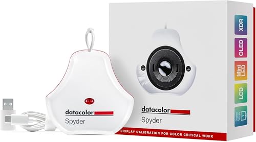
datacolor Spyder – Monitor Calibrator for Graphic Designers, Photographers, and Content Creators, Shows You True Colors, Works on OLED Monitors & LED Screens, Easy-to-Use Color Calibration Tool
Color “Surprises” Are a Thing of the Past: Datacolor’s exclusive DevicePreview TM Beta feature simulates what your photos…
As an affiliate, we earn on qualifying purchases.
As an affiliate, we earn on qualifying purchases.
What Are sRGB, DCI-P3, and Adobe RGB?

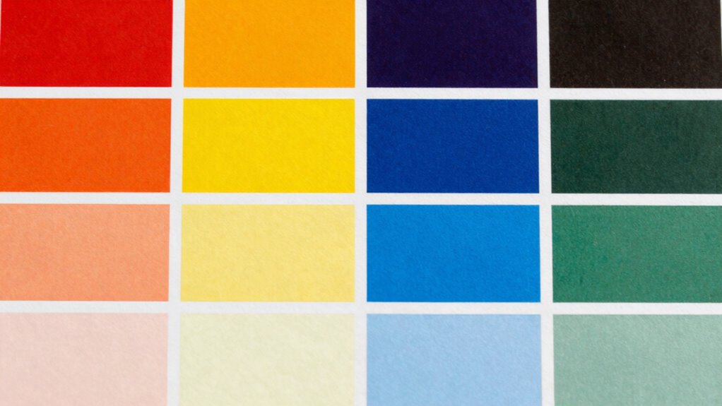
Have you ever wondered what makes different screens and printers display colors differently? It all comes down to color spaces like sRGB, DCI-P3, and Adobe RGB. These are standardized ranges of colors that devices use for color management. sRGB is the most common, designed for the web and consumer devices, offering a smaller color gamut. DCI-P3 provides a wider range, especially for digital cinema and high-end displays, making images more vibrant. Adobe RGB covers even more colors, mainly used by photographers and designers for professional work. Proper color calibration ensures your device accurately reproduces these color spaces. Understanding these differences helps you choose the right space for your needs, ensuring your colors stay consistent across screens and printers. The color spaces you select can significantly impact the visual fidelity and accuracy of your digital content, especially when considering color management practices to ensure consistency.
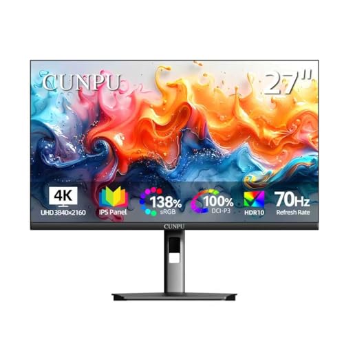
CUNPU 27 Inch 4K 70Hz Monitor, UHD (3840 * 2160) IPS Ultra-Slim Bezel Monitor for Photo Video Editing, ΔE < 2, 100% DCI-P3, 1.07B+ Colors, PIP-PBP, Adaptive Sync, DP/HDMI, Black
SUPERIOR 4K IMAGE QUALITY: The CUNPU 4K monitor boasts a 27-inch display with four times the pixel density…
As an affiliate, we earn on qualifying purchases.
As an affiliate, we earn on qualifying purchases.
How Do These Color Spaces Differ in Gamut and Color Range?

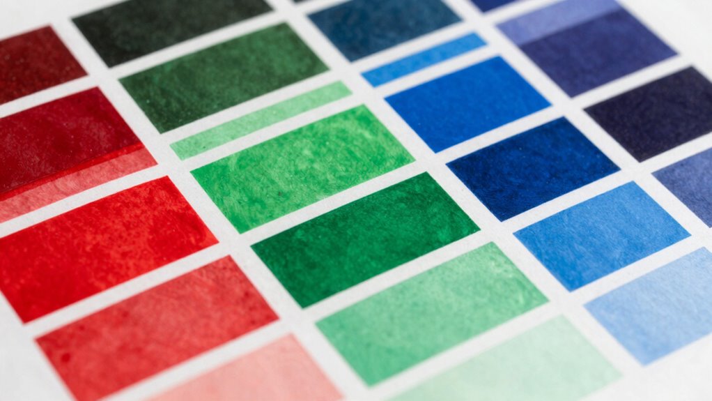
Different color spaces have varying gamut sizes, which determine how many distinct colors they can display. This affects how accurately they reproduce colors, especially vibrant or saturated hues. Understanding these differences helps you choose the right color space for your specific needs.
Gamut Size Variations
Gamut size determines how broad a range of colors a color space can represent, and this variation substantially impacts your work. Larger gamuts like Adobe RGB encompass more colors, aligning with advanced color theory and enhancing visual storytelling. Smaller gamuts like sRGB are more limited but more compatible across devices. Additionally, understanding the color range helps in selecting the appropriate color space for specific projects and ensuring consistency across different display mediums. Consider these key points:
- Color Range: Larger gamuts display more vibrant, saturated colors, influencing color psychology and emotional impact.
- Precision: Broader gamuts allow for finer gradations, essential for professional photo editing.
- Compatibility: Smaller gamuts are more universally supported, but may limit creative choices.
- Application: Understanding these differences helps you choose the right color space for your project’s intent and audience.
Color Reproduction Capabilities
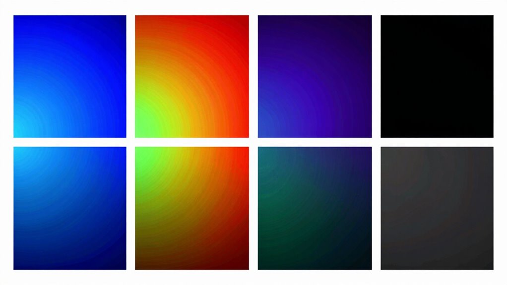
Ever wondered how color spaces truly differ in their ability to reproduce colors? Your choice impacts the vividness and accuracy of images, essential for effective color calibration. sRGB offers a smaller gamut, limiting the range of colors, which can affect the emotional impact tied to color psychology. DCI-P3 covers a wider spectrum, especially in reds and greens, making it ideal for cinematic visuals that demand richer, more immersive colors. Adobe RGB provides an even broader range, perfect for professional photography and print work where color precision matters most. Understanding these differences helps you select the right space to match your needs, ensuring your visuals convey the intended mood and message. Ultimately, your decision shapes how accurately colors are reproduced and perceived.

waveshare 7inch Wide Color Gamut Capacitive Touch Display, Compatible with Raspberry Pi 5/4B/3B/Zero/Zero W/Zero 2W/Pico/Pico, Supports Windows 11/10/8.1/8/7 and Jetson Nano/TX2/Xavier N/Orin
1280 × 800 resolution, provides clear image and vivid color display effect
As an affiliate, we earn on qualifying purchases.
As an affiliate, we earn on qualifying purchases.
Which Devices Use sRGB, DCI-P3, and Adobe RGB?

Many modern devices are designed to support specific color spaces like sRGB, DCI-P3, or Adobe RGB to optimize visual performance. Understanding which devices use each color space assists you with effective color management and proper display calibration.
- Smartphones and tablets often support sRGB, but high-end models now include DCI-P3 for richer colors.
- Digital cinema projectors primarily use DCI-P3 to match cinema standards.
- Professional monitors for photography and design typically support Adobe RGB for color accuracy.
- Gaming monitors may support DCI-P3 to deliver vibrant visuals.
Knowing which device supports which color space helps ensure your display is calibrated correctly for your needs, optimizing color reproduction and consistency.
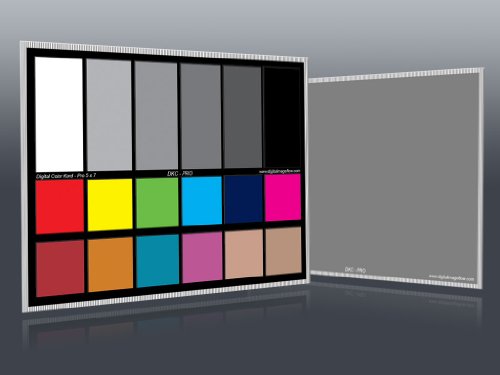
DGK Color Tools DKC-Pro 5" x 7" Set of 2 White Balance and Color Calibration Charts with 12% and 18% Gray – Pro Quality – Includes Frame Stand and User Guide
Professional version of our popular DKK Card with n-Chrome coated color targets
As an affiliate, we earn on qualifying purchases.
As an affiliate, we earn on qualifying purchases.
Why Is Color Accuracy Important in Photography and Video?

Accurate colors are essential in photography and video because they guarantee that the images and footage you create reflect the true scene or subject. Proper color management ensures consistency across devices, so what you see is what others will see. Without precise color calibration, colors may appear dull, oversaturated, or mismatched, compromising your work’s integrity. This is especially critical for client projects, branding, or artistic expression. To maintain accuracy, you need reliable calibration tools and techniques. Here’s why:
| Aspect | Importance | Result | Tools Needed |
|---|---|---|---|
| Color Management | Ensures consistency across devices | Uniform look for all screens | Color calibration hardware |
| Color Calibration | Fine-tunes display accuracy | Precise color reproduction | Calibration software |
| Quality Control | Prevents color shifts over time | Consistent viewing experience | Regular calibration |
Additionally, understanding different color spaces like sRGB, DCI-P3, and Adobe RGB helps optimize color accuracy for various media outputs.
How to Decide When to Use sRGB or Other Color Spaces?

Choosing the right color space depends on your intended use and target medium. sRGB is the default for most web and consumer devices because it offers broad compatibility and standardizes colors across platforms. To decide whether to use sRGB or another space, consider these factors:
- Target audience and display: If your work is for the web or social media, stick with sRGB for consistent color management.
- Color accuracy needs: For professional printing or photography, Adobe RGB or DCI-P3 might be better, but ensure proper calibration tools are utilized.
- Device capabilities: Use calibration tools to ensure your monitor accurately displays your chosen color space.
- Future-proofing: Know your audience’s devices and platforms to select the most compatible color space, avoiding color shifts in translation.
This approach helps you maintain consistent, accurate colors across different mediums.
What Is DCI-P3, and How Does It Improve Cinematic Content?
Have you ever wondered how modern cinematic content achieves such vibrant and lifelike colors? DCI-P3 plays a vital role in this, offering a wider color gamut than standard sRGB. It allows filmmakers to display richer reds and greens, elevating visual storytelling. Proper color calibration and effective color management guarantee content looks consistent across screens, maximizing DCI-P3’s potential. This color space enhances the depth and realism of film visuals, engaging viewers more deeply.
| Color Space | Coverage | Best Use Case | Key Advantage |
|---|---|---|---|
| sRGB | 72% | Web, Office | Compatibility |
| DCI-P3 | 98% | Cinema, HDR | Vivid Colors |
| Adobe RGB | 99% | Printing, Design | Color Range |
| Rec. 2020 | 100% | 8K TVs, UHD | Future-Proof |
This guarantees your cinematic content pops with accurate, immersive visuals.
Is Adobe RGB Necessary for Professional Printing and Design?
For professional printing and design, Adobe RGB is often considered essential because it offers a broader color gamut than sRGB, capturing more vibrant and nuanced colors. If you’re serious about color accuracy, mastering color calibration and color management becomes vital to guarantee your work matches the intended output. Additionally, understanding the differences between color spaces like color gamut can help you make more informed decisions for your projects. Recognizing the importance of color management ensures consistent results across various devices and media. Consider these points:
- Adobe RGB’s wider gamut allows for richer, more detailed colors in print materials.
- Proper color calibration ensures consistency across devices, indispensable for professional projects.
- Effective color management helps maintain color fidelity from design to print.
- Using Adobe RGB can reduce color shifts, especially when working with high-end printers and materials.
While not always necessary, Adobe RGB offers significant benefits for those aiming for optimal color precision in professional settings.
How to Check Which Color Space Your Devices Support?
Determining which color spaces your devices support is a crucial step in guaranteeing accurate color reproduction across your workflow. Start by checking your device specifications, often found in user manuals or manufacturer websites, for supported color profiles. You can also use color management tools or software like DisplayCAL or ColorSync to test and calibrate your screens. These tools help you verify if your device supports color calibration for specific color spaces such as sRGB, Adobe RGB, or DCI-P3. When you know your device’s supported color spaces, you can optimize your workflow for consistent color accuracy. This step ensures your color management process aligns with your hardware capabilities, minimizing inaccuracies and delivering more reliable results.
Tips for Converting Between Color Spaces Without Quality Loss
When converting between color spaces, maintaining image quality is key to guaranteeing your visuals stay true to their original intent. To do this effectively, follow these tips:
- Always perform proper monitor calibration to ensure your display accurately reproduces colors during the conversion process.
- Use professional software that supports color management and preserves color profiles during conversions.
- Convert using a high-quality color engine to minimize artifacts and color shifts.
- Double-check your color calibration regularly to avoid drift and confirm consistent results.
Choosing the Right Color Space for Your Project?
Choosing the right color space depends on your project’s type, display medium, and desired color accuracy. You need to take into account whether your work is for print, digital screens, or professional editing, as each demands different color profiles. Understanding these factors helps you select a color space that guarantees your colors look their best everywhere. Additionally, being aware of wall surface finishes and how they influence color perception can further refine your choice.
Project Type Considerations
Selecting the right color space hinges on the specific type of project you’re working on, as different formats are tailored for different outcomes. Your choice impacts color calibration and profiling, guaranteeing accurate reproduction. Here are key considerations:
- Photography: Use Adobe RGB for wider color range, but guarantee proper color profiling and calibration for print and digital outputs.
- Video Production: DCI-P3 is ideal for cinematic content, requiring precise color management aligned with display standards.
- Web Design: sRGB is best, as it’s universally supported across browsers and devices, simplifying color consistency.
- Print: Opt for color spaces compatible with print profiles, like Adobe RGB, with thorough color calibration for accurate results.
Matching your project type with the appropriate color space ensures ideal color fidelity from start to finish.
Display Compatibility Factors
Ensuring your color space aligns with the display devices you use is essential for consistent and accurate color reproduction. Proper display calibration is key; it ensures your monitor accurately reflects the chosen color space, avoiding discrepancies. Color calibration adjusts your display’s settings to match a standard, providing a reliable foundation for color work. If your display isn’t calibrated, even the best color space choice can produce inconsistent results. Compatibility also depends on your device’s support for specific color gamuts—some screens handle wide color gamuts like DCI-P3 or Adobe RGB better than others. Before starting your project, verify your monitor’s capabilities and perform regular display calibration. This ensures your selected color space accurately represents your work across different devices, maintaining visual consistency and color fidelity.
Color Accuracy Goals
Determining your project’s color accuracy goals is crucial because it guides you in selecting the most appropriate color space. If you need precise color consistency across devices or media, choose a color space that supports that requirement. Here are key considerations:
- Color consistency: Decide if your project demands exact colors across screens and prints.
- Target audience: Know whether your viewers will see your work on standard or high-end displays.
- Calibration techniques: Use proper calibration to ensure your display matches your chosen color space.
- Project scope: For digital content, sRGB might suffice; for professional photography or printing, Adobe RGB or DCI-P3 could be necessary.
- Understanding display technology: Familiarity with display technology like sRGB, DCI-P3, and Adobe RGB helps in making informed choices based on your project’s needs.
Aligning your goals with the right color space ensures accurate, consistent results throughout your workflow.
Frequently Asked Questions
Can Color Spaces Be Customized for Specific Devices or Workflows?
Yes, you can customize color spaces for specific devices or workflows. By calibrating your device accurately, you guarantee colors are consistent and true to your needs. Custom color profiles help optimize your workflow, especially for tasks like photography or video editing, where precise color representation matters. You can create or modify color spaces to match your device’s capabilities, improving accuracy and efficiency throughout your creative process.
How Does Ambient Lighting Affect Color Accuracy Perception?
Ambient lighting is vital to your color perception—studies show it can alter perceived brightness and hue by up to 30%. When your environment is too bright or poorly lit, it washes out colors, making them seem less vibrant. To guarantee accurate color perception, work in neutral, controlled lighting conditions. Adjusting ambient lighting helps you see true colors, especially essential for tasks like editing photos or designing visuals.
Are There Any Legal Standards for Color Spaces in Media?
There are some legal standards for color spaces in media, mainly through industry standards and regulation. Color space regulation guarantees consistency and safety in visual content, especially in advertising, broadcasting, and digital cinema. You should follow these standards to meet legal and professional requirements, like using specified color gamuts for broadcasting or advertising to ensure accurate color reproduction and compliance with regional laws and guidelines.
How Do Color Spaces Affect Online Image and Video Compression?
You should know that color spaces influence online image and video compression by affecting color consistency and gamut limitations. When you compress content, limited color gamuts may cause color shifts or dullness, especially in vibrant scenes. Choosing a proper color space guarantees your visuals stay true across devices, maintaining color accuracy and consistency. Smaller gamuts are easier to compress but might sacrifice color richness, so balancing quality and compression is key.
What Are Future Trends in Color Space Development?
You should expect future color space development to prioritize enhanced color accuracy and easier color calibration. Manufacturers will likely create wider gamuts that better represent real-world colors, making displays more vivid and true-to-life. Advances may also focus on standardization, ensuring consistent color reproduction across devices. As a result, you’ll experience more precise colors, better visual fidelity, and simplified calibration processes, improving your overall multimedia experience.
Conclusion
Ultimately, choosing the right color space isn’t just about technical specs; it’s about what your project demands. While sRGB offers broad compatibility like a universal language, Adobe RGB and DCI-P3 push vibrant boundaries like artists with bold palettes. Your choice shapes the viewer’s experience—simple or stunning. So, weigh your needs carefully: do you prioritize consistency or creativity? The right color space sets the tone—make it count.